
You can prove anything with statistics
It’s a statement often repeated — in the media, in boardrooms, during political debates, and even within scientific circles. But is it true?
A few months ago, I heard the statement again. This time during an interview on Sporza.be with a professional cyclist. That was the trigger for writing this blog.
But is the cyclist right?
Yes…and no.
Statistics is one of the most powerful tools we have to understand reality. It helps identify patterns, evaluate interventions, improve processes, and support data-driven decisions. In fields such as science, manufacturing, healthcare, and policy-making, statistics is indispensable.
Yet the same tool, when misused, can distort reality instead of clarifying it.
When statistics mislead
Careless or biased use of statistics can lead to incorrect conclusions and poor decisions.
Common problems include:
- selective reporting of favourable results
- non-representative samples
- lack of randomisation
- failure to recognise natural variation
- confusing correlation with causation
These issues explain why studies sometimes contradict each other — and why “statistically proven” claims often rest on weak foundations. In extreme cases, the consequences can be severe. Remember the Challenger Disaster (1986): a misleading chart lead to wrong conclusions and a disastrous outcome.
The Challenger case – the impact of missing data
In January 1986, the launch of the Space Shuttle Challenger had already been postponed several times. Weather forecasts predicted unusually low temperatures (below 50°F/10°C), leading to yet another rescheduling.
A teleconference was held between NASA personnel and Morton Thiokol, the manufacturer of the solid rocket boosters, to assess the impact of low temperatures on the booster design. Particular concern was raised about the rubber-like O-ring seals.
At low temperatures, these O-rings were known to stiffen, potentially compromising their ability to seal the joint during launch. The specified operating temperature for the O-rings was not below 53°F (11,7°C). Despite this, the decision was taken to proceed with the launch. What followed is well known. The Challenger exploded shortly after launch, and all seven crew members lost their lives.
Was missing data the cause?
In the aftermath, questions were raised. Was the launch decision driven by economic or political pressure after repeated delays? Or was there a more technical explanation? Could relevant data have been missing from the decision-making process?
A post-accident investigation pointed to a critical issue in how flight data had been presented. A chart was used that plotted the number of O-rings showing distress as a function of temperature. However, this chart included only flights in which O-ring distress had occurred. Flights in which no O-ring anomalies were observed were not shown (chart 1).
Chart 1 – Number of distressed O-rings as a function of temperature (excluding flights with no O-ring distress)
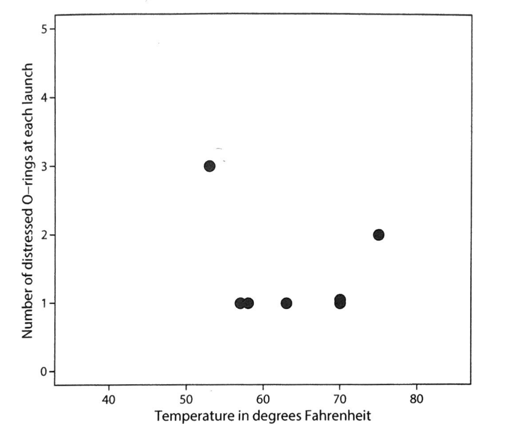
Based on this (incomplete) chart, no clear relationship between temperature and O-ring performance was apparent. When the full dataset was reconstructed — including flights with zero O-ring distress — a very different picture emerged.
Chart 2 – Number of distressed O-rings as a function temperature (full data set – including flights with no O-ring distress)
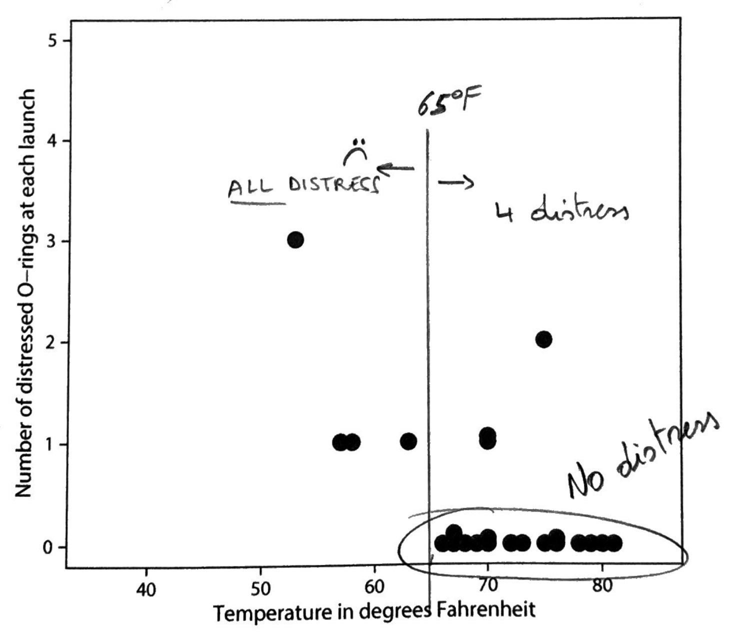
With all data included, it became clear that flights at higher temperatures were far more likely to show no O-ring problems. Above 65°F (18,3°C), only four flights exhibited any O-ring distress. Below 65°F, every flight showed at least one distressed O-ring.
While some O-ring distress still occurred at higher temperatures, the pattern below 65°F was unmistakable. The increased risk at lower temperatures could not be ignored.
Given that the forecast launch temperature was around 30°F (-1°C), the conclusion drawn from the complete dataset would likely have been different. The risk was substantially higher than suggested by the original chart.
Missing data clearly affected how risk was perceived. Whether economic and political pressure merely coincided with this omission, or acted as a catalyst for overlooking it, remains open to interpretation. What is certain is that incomplete data led to a decision made under a false sense of safety.
Final thought: how a simple chart — one of the most basic elements of statistics — can have such a profound impact on decision-making. In this case, a profoundly negative one. It inevitably raises the question of how often decisions are influenced by the flawed use or misunderstanding of other statistical concepts and tools.
Why statistical literacy matters
In an age of dashboards, KPIs and automated reports, more data does not automatically mean better decisions. Poor analysis can result in wasted resources, misinformation, incorrect claims, and loss of trust among customers, patients, or stakeholders.
The real challenge is not analysing more data, but analysing data correctly
Learn how to think like a data detective
In our ongoing blog series, we explore:
- how to spot misleading data
- how statistical traps arise
- how to interpret results responsibly
- how to distinguish noise from real effects
???? Subscribe to the newsletter
???? Download the free e-book: “Data Without Illusions – 7 Deadly Traps”
???? Book a no-obligation consultation
PS
Looking for an effective way to solve problems, deepen your understanding of variation, or learn how to distinguish facts from fiction? Then be sure to check out our Masterclasses.